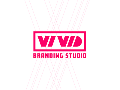
Vivid Lettermark
Another take on a logo for a potential branding studio. This type going for a gridded letter mark. The space between the I and the V kind of bother me though..what do you think?
More by ArticaVisuals View profile
Like
