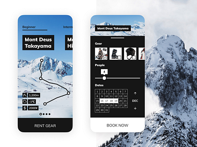
Ski Resort Booking App User Interface
A 90 minute UI practice. Prompt generated with www.sharpen.design and it was "Design anything you want for a ski resort". So I designed a booking app for an imaginary ski resort. 🎿
Learnings and Reflections 🧐:
- I think I could improve the second screen. Users might need more information about the gear before booking. Perhaps a more robust card carousel with more information is needed.
- I think the hierarchy and the information architecture of the second screen can be improved as well.
Comments and feedback welcome! 😊
More by Mubarak Marafa View profile
Like
