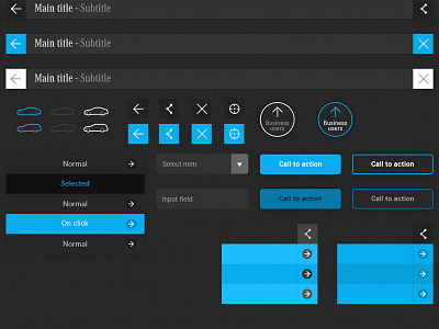
iPad app gui
Early stages for this app now being built as a prototype to show the client during the week.
The design is as flat as possible, trying to remove unnecessary double 1px lines, drop shadows, embossed effects. I tried instead to work much more on the contrast between plain colours. Hope it will get accepted :)
What do you guys think?
Larger view attached
More by Matia Gobbo View profile
Like
