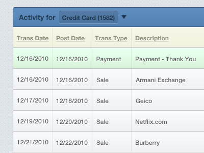
Chase Transaction Re-align
The Chase transactions UI hurts my eyes (actually a lot of Chase UI does), it's hard to read and some of it doesn't make sense. Here is the full thing and comparison. Full version I also think the transaction information is backwards and it's currently hard to decipher between transactions.
More by Chad Hietala View profile
Like
