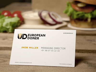
EUROPEAN DONER
We puzzled out the ultimate solution to meet all the demands of our client. They were in need of an exceptional branding to place their brand internationally. Our creative team took up the challenge and developed an awesome visual identity for the brand. Here you go!
The brand identity has been derived from the brand name EUROPEAN DONER in an elusive way. In the brand acronym, we choose to skip the first letter 'E' of the brand name and use the second letter 'U' instead. The modern generation has already begun to overthrow the conventional language practices and the brand follows nothing but modern languages. UD in itself has an element of novelty which exalts the brand to an internationally acclaimed premium range.
For more : https://www.behance.net/CapioInteractive


