Photo App Design Process
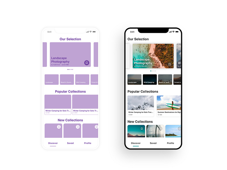
Been experimenting with sticky chips on this new app design for easier navigation and a friendlier user experience at the same time I wanted to share my design approach moving from wireframes to the high fidelity mockup.
The interaction was figured out since the low fidelity wireframe which sometimes comes very handy for testing interactions on an early stage and have a better idea about where the design is going. Make sure to check the original animated shot and leave your thoughts about it.
Do not forget to give some love to this one too.
Thank you all !
More by Younes ANNAKI View profile
Like
