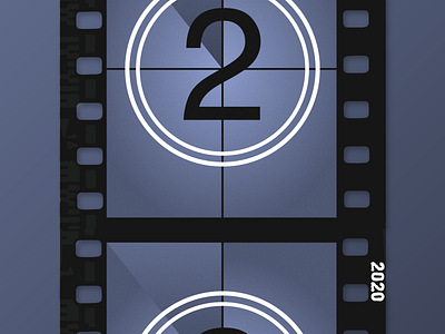
2 Days Until 2020!
My background is graphic design and architecture, rather than illustration, so I wanted to go with a concept that would play to those strengths. The idea was suggested to me by my spouse, and I originally thought I'd go further with a distressed filmstrip look. I looked for references online, so that I could get the details of the film edge right. The key for me in making this work was to move the illustration off-center; partially advancing the frame. I spent way too much time thinking about details like whether it should show 2019 or 2020, the level of distress (or not), how far to advance the film against the canvas, whether the next frame should suggest a 1 or a 2, etc. At the detail level, I feel there are several contradictions like that, but I decided that I preferred it that way.
