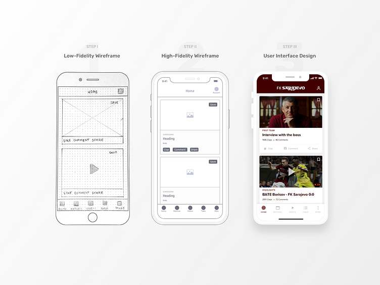
How It's Made: Mobile App
Hi Dribbblers! 👋 As I don’t see much UX process on Dribbble, I’ve decided to show part of it.
Step 1️⃣: It all starts with pen and paper! After doing a research, I used low fidelity wireframes in the early stages of development process to establish a basic structure of mobile app screens.
Step 2️⃣: After sketching the wireframes, it was time to design high-fidelity wireframes. This way I am able to fill in the details that were missing in their low-fidelity predecessors.
Step 3️⃣: The actual design! At this stage, we have everything in place and this is good to be a final version. (Final version. Yeah right! 😅)
This project was part of my UX and UI practice. See the whole story behind it. Click on the link below! ⬇️
More by Armin Graca View profile
Like
