Typography Poster: 001
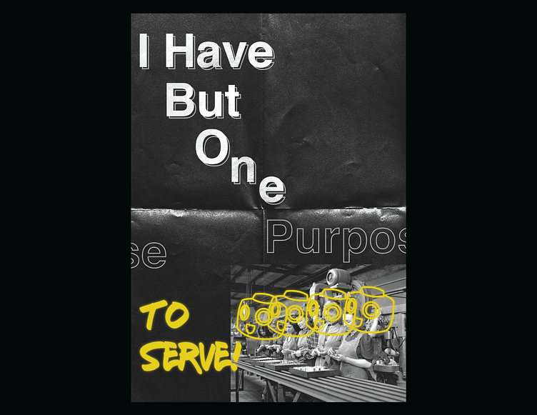
So what you see now is the beginning of a long draw out process to work and refine my typography skills by consistently creating posters. I recently watched an interview on The Futurs youtube channel about a designer named Roy Cranston who designs very dynamic, dark, and gritty posters that focused on type.
I was immediately drawn to this style as I felt it represented a bit more of who I am. I enjoy doing UI/UX design work but its nice to break out of that mold and work on designs that are little more expressive without so many constraints.
Please share any feedback and comments you have, thanks!