Electerious 2013
My 2013 redesign ist finally finished and I'm happy to share the result with you :)
I completely redesigned, simplified, added retina support and made my new site responsive (of course).
Check it out: http://electerious.com
----
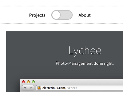
My goal was to keep everything as minimal as possible and focus on two things I expect from a portfolio: What is he doing & Who is he? This two sections (Projects & About) are separated by a switch. No other navigation or complex menu.
The pictures are now (compared to my old site) big and shown inside a browser to directly let the visitor know what this site is about and what I'm doing. I hope you like it :)
Follow @electerious
More by Tobias Reich View profile
Like
