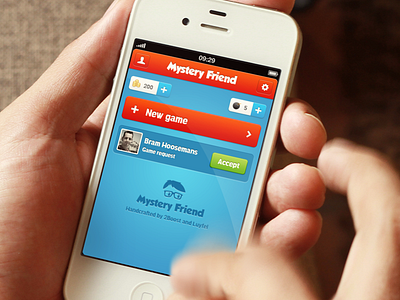
Dashboard
We are developing a new app called Mystery Friend. Here's one of the first screens. What do you guys think of the red "new game" button? Should it be a different color?
Follow @MysteryFriend on Twitter or visit www.mysteryfriend.com.
More by Bram Hoosemans View profile
Like

