Raleway Metafizzy
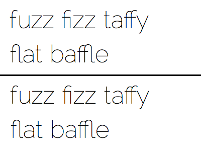
I'd like to use Matt McInerney's Raleway for branding for a new site: Metafizzy. I'm not a fan of how the crossbar of the lowercase f lies below the x-height. "f" looks okay all by itself, but when put against a square-shaped letter like "z" the mis-match is apparent.
Lately Firefox has been taken a lot of heat as WebKit continues to dominate with sexier CSS features. But those users still stubborn enough to use Firefox do get OpenType ligatures when present. So Metafizzy looks all the more slick with the "fi" ligature.
With Mr. McInerney's blessing, I'm giving a shot at tweaking it myself. I'm using FontForge (with its whoa-thats-ugly-AND-pixelated interface) to go in and change the glyphs.
