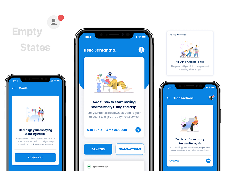
Budget App Empty States - Fintech App UX UI Design
🚩 April update: Raised $100K in pre-seed funding at a $2M evaluation🚩 --------------------------------------- Website: https://leysiapp.com
Its always important to design empty states that communicates with our users and take action. Let's just not keep it boring with "Empty/Error Texts" on emptystates --- instead add a bit of character.
This is part of my fintech app UI Kit, look out for more to come.
Want me to help you design your own #fintech app?
🔻 Get In Touch 🔻 hello@mrtasin.com
More by ✨ Tasin - Opacity Labs® View profile
Like
