Social website
Sup guys?
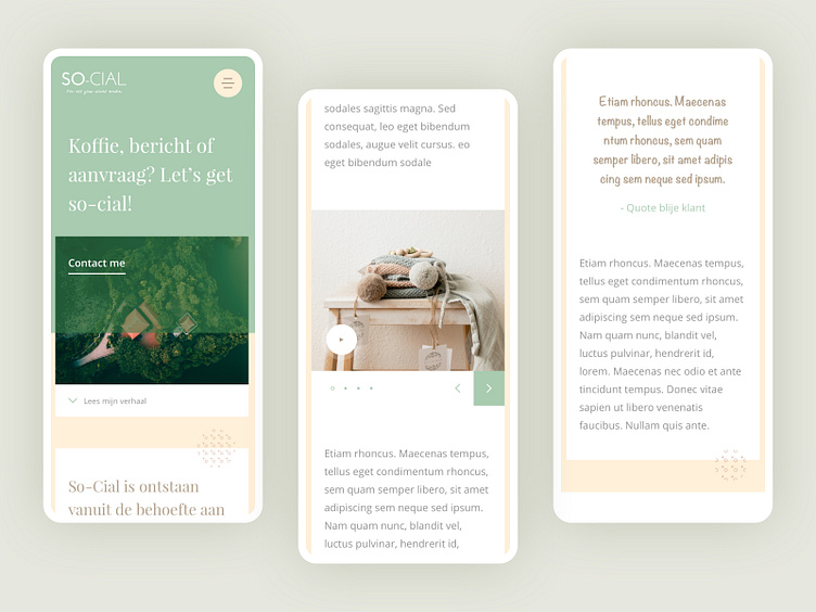
Been a while since I did this responsive design for a client. The client wanted to start up a social consultancy company.
To make so-cial stick out above the masses I chose a different approach than the other brands out there. I focused on good imagery, a minimalistic style and optimal reading experience.
What makes this playful is the use of circulair patterns that have a little parallax effect. It makes the platform feel lively, like a timeline.
See it live: https://so-cial.nl/
Press “F” to show some ❤!
More by Patrick Kaman View profile
Like
