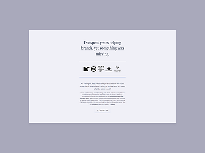
Concept Website exploration - Landing page
Alright, last round of iterations before I take some vacations to enjoy the family.
I tried to break the previous layout by playing with the colors a bit more. When everything was grey, it felt a bit gloomy at times, which is something I want to avoid.
I added this Values/Services section on the homepage, as it was missing. Even tho everything was already there in the content, most people won't read through and need anchors. That solves it.
While scrolling, the footer also felt like it was catching too much attention. Hence I 'muted' it a bit more, as the black contrasts way less with the grey up above.
I also tried this huge section with a textured mockup, to appreciate the details. Not sure I'll keep that as is but I liked the idea. What's your opinion about it?
Let me know in the comments below, and don't forget to spend time with your loved ones!
I wish you all happy holidays, and I'll see you soon. Cheers ✌


