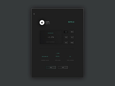
Trading app dark mode (tablet) - summary screen
Continuing with my recent fascination of skeuomorphic design which retains modernity and minimalism.
This trading app summary screen utilises the 'paper' inspiration which i have cited in my previous shots also, however i thought i would try a dark mode design too.
An element that i feel works successfully is the 'card' that displays the percentage increase. Using a 'debossed' aesthetic hopefully communicates this element is not clickable. The micro buttons to the right hand side of the card seem to have a tactile roundedness to them.
I used a mix of upper case and lower case deliberately, as i didn't want the main CTA's to be forceful- as it is an application around finance. However, i am unsure whether this mix of upper/lower works.
I am looking forward to developing some more designs for this mini project, and some motion interactions also!