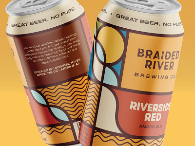
Braided River can design refresh
Braided River is getting closer to opening their doors, and so it was time to take a closer look at their can designs. The previous iteration was primarily a concept for fundraising purposes, but this revision tightens everything up for real production. In addition to finalized beer names, some of the larger changes involved refreshed color palettes and custom typography for the beer names. Using a unified block of color for the front ties together the two sections for a more clear hierarchy, and the type breaks from the systematic consistency just enough to add some personality.
More by Nonfiction View profile
Like

