Cycling blog
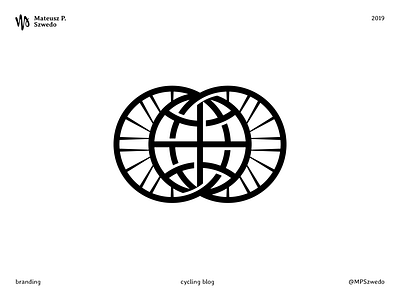
Logo for a cycling blog: 2wheels1world.
After the brief the main goal was to express visually the name.
The idea was to merge the 2 wheels with the web icon, symbolizing not only planet Earth but also the online presence.
The light blue and dark green want to underline the colours of Earth, maintaining a high contrast of luminosity. This way the logo preserves the same look and legibility when printed in black and white.
More by Mateusz P. Szwedo View profile
Like
