Acutrans Branding
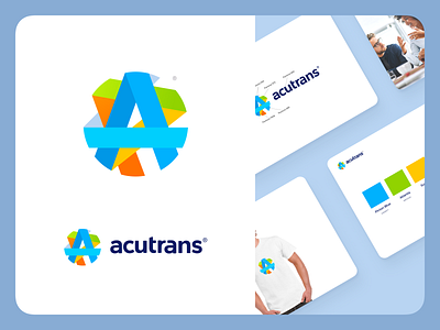
A piece of branding work I've done for Acutrans. This guys are actually quite cool translation startup, who are performing all different possible ways of translations remotely. They wanted their logo to be vivid and diverse in colors. After we tried a couple of different options they were really happy with this shape and colors.
Thanks for stopping by! 🍺
Have a design challenge to be solved? hello@octavius.design