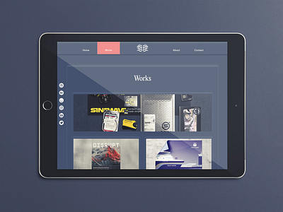
Works collection page - Concept Website - Graphikas
This one is likely to change a lot, as I'm considering switching the cards for fullscreen.
Both versions look quite nice, but from a user perspective, I'm wondering if it's better to see all of them quickly or to have a quick overview of each?
Maybe a solution would be to display more info from the start, but I didn't want to overload the page with names that won't mean anything to most (since I haven't worked with huge brands yet).
What are your thoughts on this?
Is it better to display everything quickly and let the user decide which info he wants to get?
or
to give access to most info while skipping a lot of details?
To put everything into context, the goal of this would be to drive potential clients to contact me for brand design freelance projects.
Let me know in the comments!
Have a good one folks.

