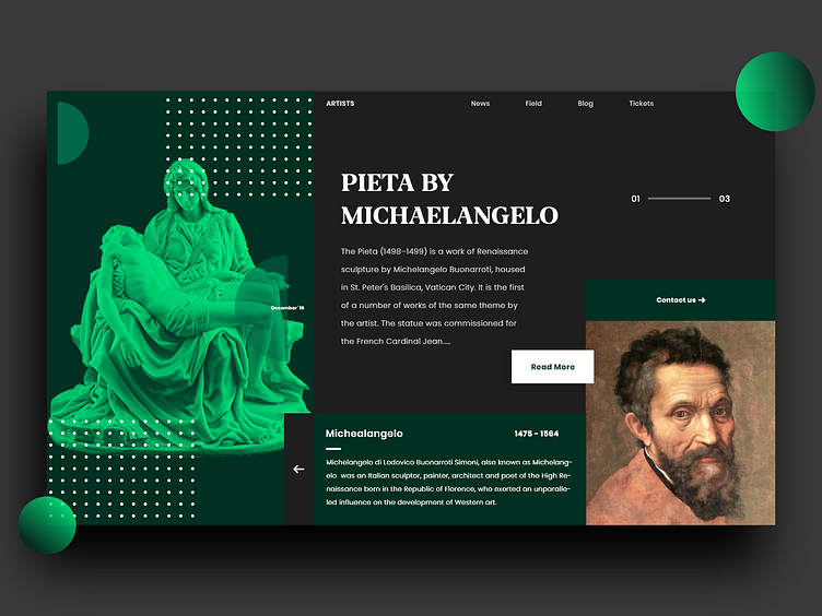
Landing Page
We included a futuristic design with a dark colour combination. We gave more attention to typography and composition to make clear first impressions.
Share your reviews on how can we make it more minimal, Have an awesome project? Shoot your email to info@unikwan.com
More by UniKwan Innovations View profile
Like
