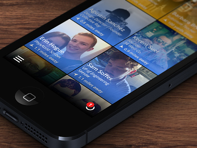
Highlight Redesign Concept
The other day I downloaded Highlight. It is a great concept, but I feel the current UI is very data driven with a lot of meta data visible at all times. It also lacks a brand personality, which sucks, because there is so much you can do with their branding.
In my example, I wanted to re-create the main screen. This is the screen where you see who is near you. I wanted to remove all information that isn't needed on this initial screen. Diving into a profile will give more meta data on that person. I also put the UI elements at the bottom so you didn't have to cross the whole device just to open the menu.
Blue people are just people around you that Highlight thinks you should know, yellow are people you have already highlighted.
This was just a fun exercise for me so feel free to let me know what you think!
Check out the @2x & real pixels.

