CHARLOTTE FC - LOGO CONCEPT
CHARLOTTE FC - Logo Concept
The other day, Charlotte, NC was awarded the 30th franchise in the MLS.
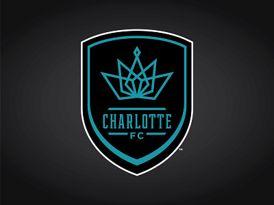
As one whom loves the name idea, "All Carolina FC", I thought i'd take a different approach and try a design for my other favorite name and more for fitting for city, "Charlotte FC".
The logo features a modernized crown for the Queen City. It also features teal and black, a color combination not yet used in the MLS. A color combination that should go over quite nicely in the community. The four parts of the crown represent "Club. Community. Charlotte. Country." The diamond at the top brings everything together, representing the fans, the Carolinas...everything.
I'm quite happy how this concept has turned out.
I hope you all enjoy the secondary logos i've created for "CFC".
It's an exciting time for soccer in Charlotte.
Enjoy!


