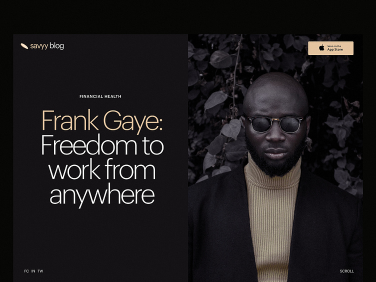
Blog Article for Financial Service
Another look at the minimalist and elegant web design for the cashback service. This time it's a page of the blog article. Dark background, prominent image, readable font, trendy split screen, and simple navigation make the page clear, eye-pleasing, and scannable for visitors. Stay tuned to see more!
Also, welcome to review our set of design tips on improving web readability and learn about the popular types of helpful visual dividers in user interfaces.
More by tubik View profile
Services by tubik
Like

