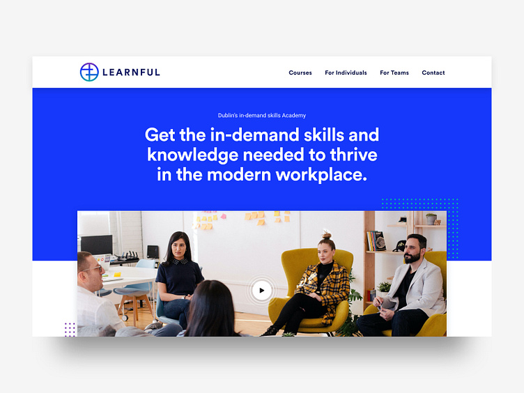
Learnful homepage hero unit
The homepage design brings the brand colour to the front. Content is as important as layout. The subtitle at the top is good for SEO. The main headline is aimed at users. It starts with a verb GET, then explains what you do and why they need it.
The circles beside the image are a subtle nod to the brandmark. The video button also features subtle circles radiating out from the centre.
More by Hidden Depth View profile
Like
