Daily UI 4
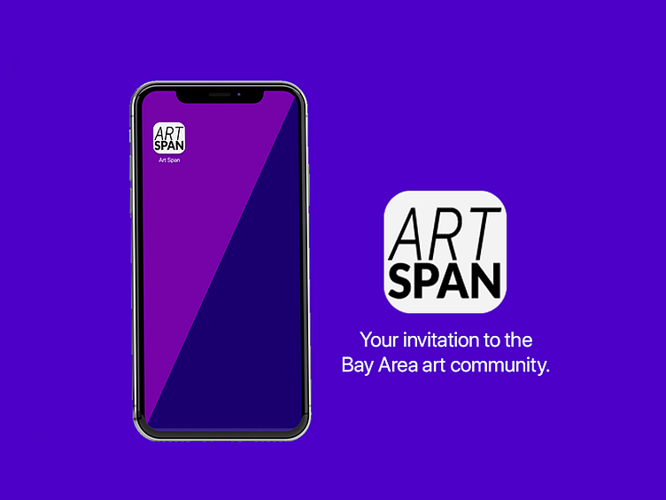
Day 4 prompt: App Icon
Yes, I'm a couple days behind on posting. Starting this challenge before holiday travels may have been a mistake, but I'm still going to attempt to catch-up and then stay on top of it.
Ok, for the process. I went for updating the logo and icon of ArtSpan. It wasn't that it was bad, but the icon looked like a copy and paste of the logo and there was bad cropping. This way, I updated the styling of the font while keeping it within the icon.
I was initially doing iterations with masking the fonts with gradients or adding colors so it wouldn't be a direct copy of the ArtSpan logo, but it messed with legibility. I felt this would be simple and clear while still playing with the words and placement.
I felt with the color scheme of the app that there was a 70 or 80s vibe, so I ran with that and looked to using typography that slightly reminded me of that era. This was also a great period for art as it had an insurgence of creativity and vibrancy that was fed by collectives that made up the community.
