Minimal Type [Animated] Concept
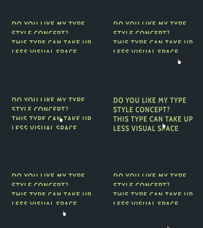
I was playing with the idea of making type lighter, taking less space on the page. It's still surprisingly legible. I tried it on some of my co-workers.
Here I've shown it with a rollover, but I also think it could stand alone.
Font's used here are "Cabin Bold"
More by Caleb Amesbury View profile
Like
