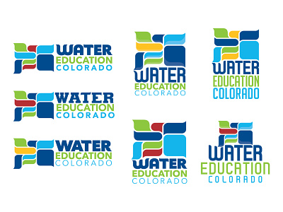
Water Education Colorado Logo Design Process 6 - Final Shot
There were many more color and typographic iterations between the last shot and this one that ultimately led us to an asymmetrical lockup of the logomark and logotype. We also explored font embellishments, basin shapes, and a host of other little details.
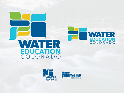
The guiding concept of the logo centers on a stylized graphic depicting Colorado’s eight watersheds. The varied shapes allow for vibrant color exploration, and form the building blocks of a rich visual language for the brand. This concept holistically embodies the organization’s mission, which can also be broken down into the three words of its name.
Water
Central to the organization’s purpose is water, and this aspect is carried out by featuring the container for Colorado’s water: our rivers. A color palette featuring “water” dominate colors and the illustration of the basins as fluid, water drop-like shapes gives strength to this idea. Bold, modern typography was customized to flow and balance the logo mark.
Education
Maps have long been used to not only to help guide us, but as an educational tool and to bring others together. The basins represent multiple people in the water community convening to share knowledge. The illustration style of the basin shapes is reminiscent of speech bubbles, a visual portrayal of the water conversation and shared learning.
Colorado
The state of Colorado is embodied in the watershed map itself, and a color palette was chosen to represent the lands of our state from the greens of the mountains and forests, the golds of the plains and Western Slope, to the blues of our clear skies and rivers.
Visit www.watereducationcolorado.org for more about this great organization and the story behind the logo.