Zippyshare logo revamp - UI exploration
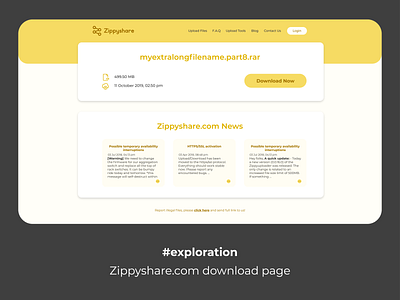
In my earlier shot, I've discussed how the Zippyshare logo could be improved. This shot is rebound shot of it and in this shot I decided to make a UI for the download page of Zippyshare.
The download page is where I noticed, Zippyshare doesn't have a simple logo. Hence the long chase for the logo. In addition to that, I also noticed that overall appeal of the download page can be improved as well. So here is my attempt to make it better.
My idea was to make the page look good and easy to navigate, while keeping the elements of the download page the same. The objective of the download page is to make user click the Download button. I decided the important elements in the page are file details and the Download button, and tried to make them stand out from the design.
I hope you like this shot. What did you like/didn't like in this? What, if anything, would you do differently? Would love to hear your thoughts on this! Cheers :)

