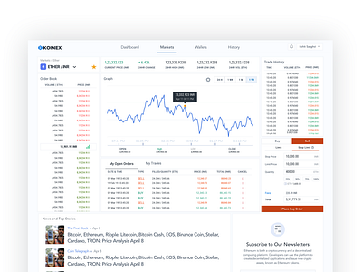
Market Screen for Selected Pair
This screen was a huge improvement from the actual market screen that the platform used to have. We aimed to make information crisp and clear, navigate to the actionable areas on the screen and give them a gist of currency performance at a glance.
~~~~~~~~~~~~~~~~~~~~~~~~~~~~~~~~~~~
Check out my latest articles on Medium:
🎭 A Sneak Peak into the Design Team at Koinex
🧑🤝🧑 Case Study on Designing Collaboration Tool for Medium
~~~~~~~~~~~~~~~~~~~~~~~~~~~~~~~~~~~
Let's be friends: 📸Instagram | 🐣Twitter | ✍️Medium
More by Shreya Saxena View profile
Like
