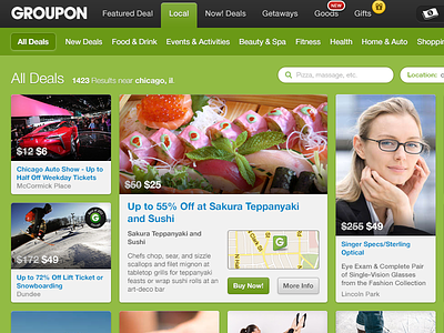
Groupon Flow Concept
Just a concept for a redesign of the "All Deals" page. I think Groupon could fit a ton more deals on screen if they went with this approach which was heavily influenced by 500px's 'Flow' layout.
I'm thinking deals with long titles and/or those that are featured would use the large format content box, those that are standard would use the square box, and those that are better presented with a portrait image would use the vertical box.
Checkout the attached PNG for the full page & let me know what you think!
More by Chris Allen View profile
Like

