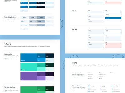
Style guide to make developers happy
Hello good humans. 👋
So Rownet was one of those clients that knew it was about time to put a new suit to their website. They have steady traction with their business, but were way behind with their online presence, to the point of having a website that doesn't respond well on mobile. So, I was tasked to design a mobile-first responsive website for them.
In order to spice things up, we agreed to use illustrations as a primary source of visual communication, mainly used in the context of introduction for each screen. So, I ended up designing 36 illustrations in total!
In a niche that is a bit conservative to creativity and innovation, I'm still happy with what I could offer. Let the year 2020 bring them more happy customers through their new responsive website. 🎅🏻
——
Think I can help you with your project? 🙋♂️ Hire me.


