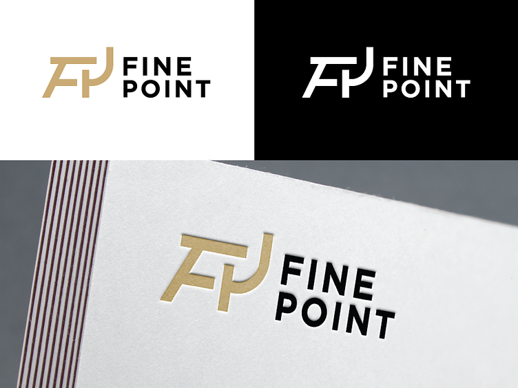
Fine Point Logo 2
This is for one of the logos I presented to the client today out of many created. They produce hi-end furniture for Scandinavian market that focuses on ecology in technology they use, elegance, and quality work.
My take was to make the logo mark in shape of the chair, but also FP as acronyms for the brand. Can't wait to see which logo they decide on!
More by Ana Baranjin View profile
Like
