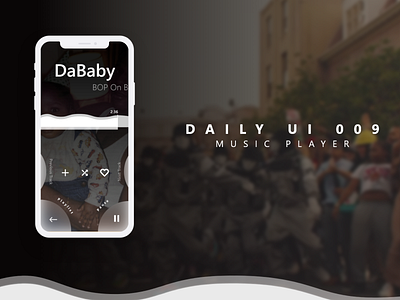
Daily UI 009 Music Player
I started this design by documenting frustrations I have with current music players.
The first thing would be scrubbing through tracks. So, I designed a prominent audio waveform with a high contrast ratio, so you can easily and quickly scrub through the track to your favorite parts.
Secondly, I wanted to rethink the typical navigation.
The Next/Previous track tap function was removed and replaced by a swipe function. And a deliberate tap button to get navigate out of the currently playing song.
The Pause/Play button, takes up the bottom right real estate of the screen, making it easy for single-hand operation.
Secondary buttons like add to playlist, shuffle, and like were moved to the center of the music player.
Ok, I'm back. My body had its own 404 error with a head cold I had to deal with. This Maryland weather always gets the best of me.
And back to design speak...
404 pages provide an interesting opportunity to showcase your brand essence and help your audience at the same time. Is your brand voice light-heart, and fun? Or is it helpful, and informative?
This 404 page could live on an eCommerce site, I imagined NL being a home decor store, so the use of a singular lamp helped illustrate that there's not much to see here.
The title is followed by answering common questions visitors may have upon landing on this page. I provide short easy to read copy and links for helping users get to where they need to go quickly.
Designed with ♥ and plenty of coffee,
Alexandré
