Klinika Bike Service - Branding
Branding and Visual Identity for Bike Service/Shop
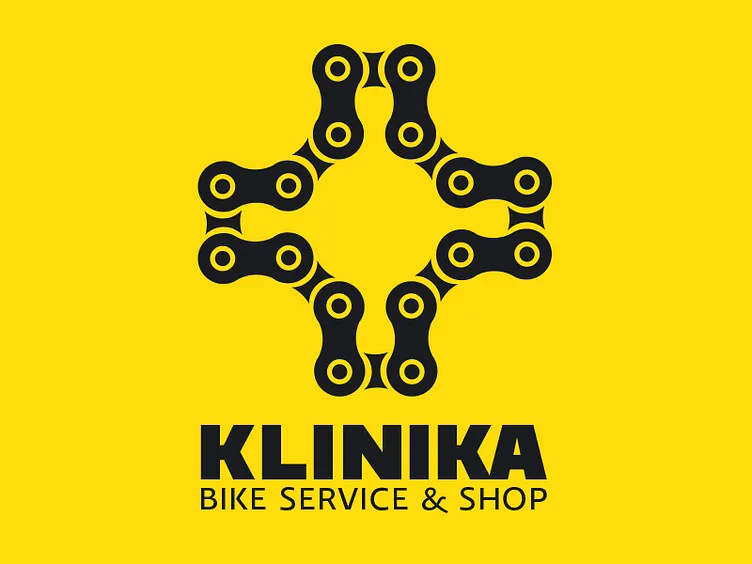
The client had a claim for the name and visual identity of the bike service. In terms of client names it was to be distinguished in the mass of different services and create ingenious image and visibility in the market. During the research a link was found between the clinic as a medical facility for treatment of diseases and health problems, and the cycle failures and functional problems related to the bike. For this reason we use the name Clinic, a place that removes all the failures and provides full service repair (healing) of the bike. The visual identity is also shaped by the example of a clinic with a large cross as a symbol of healing. Bike Clinic sign is shaped like a cross composed of a bicycle chain, which symbolizes the place where a bike is treated.
Color System -Yellow / Black The combination of yellow and black is the most impressionable color combination in the whole spectrum. The contrast between these two colors is also the best in comparison to other color combinations, and this color combination intuitively suggests work in progress, repair and construction. For this reason, this combination is ideal for color system of the bike shop because it symbolizes the brand that directly deals with the repair, arranging and caring for the functionality of bicycles.
AWARD: Sudnji dan 2012 Category: Colaboration of the year
View whole project @ http://www.behance.net/gallery/Klinika-Bike-Service-Branding/3857487
