Coqui Logo
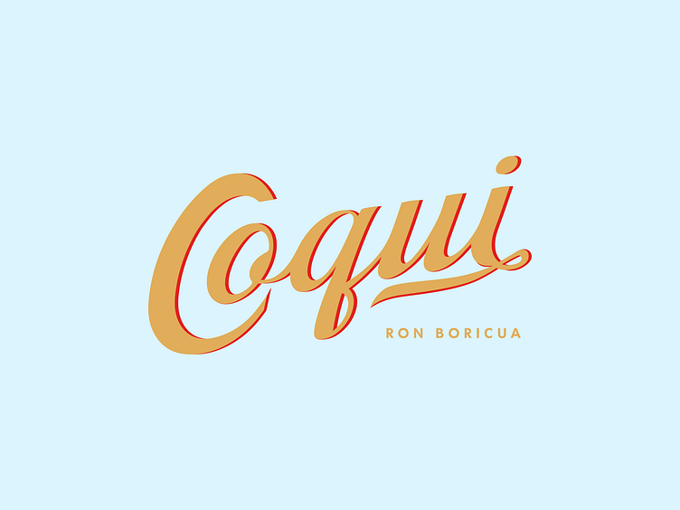
Rum has been part of Puerto Rico’s history since the early 16th century, when Spaniards brought sugarcane from Hispaniola (Dominican Republic) To PR. Ever since then, it has become a major player in the rum industry. 6 cities, 6 major distilleries all scattered across the island. With the city of Mayagüez located on the eastern shore, and though having a large quantity of brands, rich in taste of alcoholic beverages in the region, the bland and poor packaging-branding, made it only right to design a strong, visually appealing story telling quality product. One that stand strong amongst top competition in the industry. Puerto Rico is a colourful and a vibrant soul of the Caribbean. So for that, it was very important to evoke balance between fresh and luxury. A custom script logotype was developed for the brand. Creating this Logo mark meant that, it frees one out of its own complexity and give's a certain freedom. With additional cool factor. Warm like Pantones were used to create that 'vacation' like emotion, yet sustain a level of quality. Typography rules the design overall, It carries the label and communicates it's core values to it's customer. It was made sure that the design wasn't overlooked when it came to details. Small things make big difference. Also, adding 'cool' elements to the design that makes this packaging design distinct such as: PR flag on the neck of the bottle to give homage to Isla bonita.
