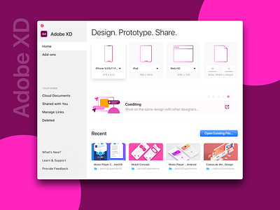
Adobe XD Start Screen
I recently opened Adobe XD after a long time and it took me a while to understand how I can open an existing file. Then I had a look at it and thought about what can be done to improve the experience?
Adobe XD Start screen looks great but a few small tweaks can improve the experience even more. So what did I change here?:
• First of all, I replaced "Your Computer" with a good old native blue button which is labeled as "Open Existing File..." and moved it to the right lower area so that it can get the attention it deserves. The absence of this was what motivated me to design it in the first place! 💡
• Gave the artboard size selection grids a hover effect. So when users hover over them, they raise a bit from the surface. Right now, Adobe XD does by changing the colors of the device icons. 🕴
• Right now the start window takes a big amount of real state on the screen but still, the contents are small. For example, the text size. It gives a cleaner look but it can be achieved using a smaller window size too. Is this even a problem? Maybe, maybe not! But it gave me peace of mind. 😇
• I tried to make the overall composition a bit more consistent.
• I know you are angry about the thumbnails in the Recent document area. Document thumbnails don't really look like that. But come on! I am posting it on Dribbble! Gotta make it a bit beautiful. 😉
• Other changes? Yes, very small.
Thank you for reading through! Please hit the like button if it deserves the effort. 😇And feel free to share your opinion.
===
Designed in 💎😉
===
