Music site front page concept
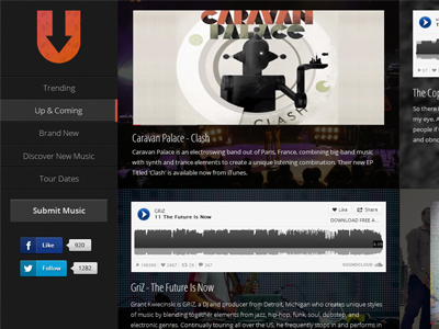
So, I was working on the front page for the new Under The Industry re-design, and half-way through it I just trashed it and had a random idea pass through. I cultivated that idea into this layout. It's unique, and possibly a bit noisy, but I'm still working out a bit of the final details.
It'll be completely responsive, with each post having a 'block', each block consisting of a background relating to that artist, overlayed with a simple pattern. Then containing the music, the title of the post, and a bit of sample text.
Be sure to check out the attachment for the full view, and I'd love to hear some feedback.
More by Andrew Schmelyun View profile
Like

