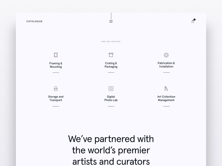
Catalogue Style Test 2
A second style test... Usually, I'm quite insistent on having a bold headline and call to action. But, the brief called for something fairly understated and soft-spoken. I challenged myself to design icons with just two boxes. One of the boxes could be rounded.
More by Jose Ocando View profile
Like
