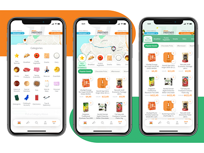
Migros Hemen Redesign
I had an opportunity to redesign Migros Hemen app. Main goal was less friction and effortless navigation. Here is home screen interaction in three steps.
Pricing, CTA and Basket related components are associated with Migros's orange main brand color, selected states and every other highlighted areas are associated with green and delivery communication is associated with warm blue which was also used with Migros Jet checkout desks in stores. Warm, energetic and youthful experience was my first goal for designing the visual language.
More by mehmet özmen View profile
Like
