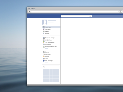
Mini Browser Example
Here’s an example use case: We’re rethinking the chat component in the bottom left of the homepage frame. At this stage it’s easy to get caught up in decisions on chrome details, but while trying stuff out, I find it easier to design relative to the dimensions of existing page attributes. At 33% scale, I can move things around quickly and still maintain a feel for the overall page and browser.
More by Soleio View profile
Like

