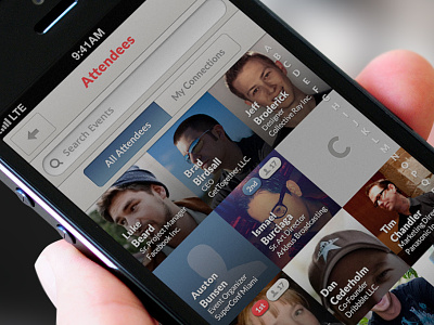
Attendees - iPhone UI
Trying to break convention of a 'boring old table view' to browse Event Attendees. It was also important, because we wanted to make sure there was a clear distinction between the Attendees screen and the regular old (in-app) Contact List.
What do you think?
--
A Collective Ray project.
More by Collective Ray View profile
Like

