Redesign QutoesCover web app
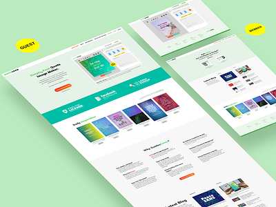
Previously, Quotescover homepage is somohow confusing. I make it tidier, get rid off any unnecessary text. And add a "feature belt" below the hero area. (that tosca bar). After running 3 weeks the conversion increased and the bounce rate decreased significantly.
I choose the mint color because it feel fresh. This site is about quotes and inspiration creator. So green make it calm and suitable for the audience. How do you think?
Thanks
More by Dian Arismawan View profile
Like
