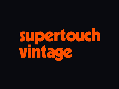
Supertouch Vintage Typemark
Had a really nice opportunity to help an old neighbor create a logo for their project over at Supertouch Vintage.
Right off the bat we knew that this would be a logotype-only approach, this turned into a really exciting excuse to lean into some fantastic typefaces from the early to mid 20th century.
After scourging the internet for history on danish typography, and a few rough type studies on non-digitized type specimen books we came up with the most simple solution - Kabel. A geometric style sans serif that was released in 1927, but gained popularity in the early 70's. It was clean, it was energized, and the historic funky kearning as a result of screen printing was too pretty to give up digitally. I'm really happy with the end result.
Thanks for lookin'!
