De Novo Nutrition Brand Identity
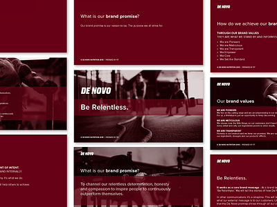


We worked closely with De Novo on their brand platform before any visuals were put together. We looked at their brand promise, mission statement and brand values. This ensured the brand identity had solid foundations when it started being visualised.
‘Be Relentless’ became everything the brand stands for. The never-give-up attitude. The constant strive to be better and do better than before. The bold logotype and shorter DN mark was adopted to show stability and structure, with the slight forward angle suggesting progression and a brand with forward momentum.
The visual language expands using the lines and gradients, suggesting a dynamic, constantly moving brand.
A large part of the new brand identity was bringing more to their social channels. This included generic sales posts, athlete announcements and engagement posts.