DA SILVA Construction
| Logotype
| 2019
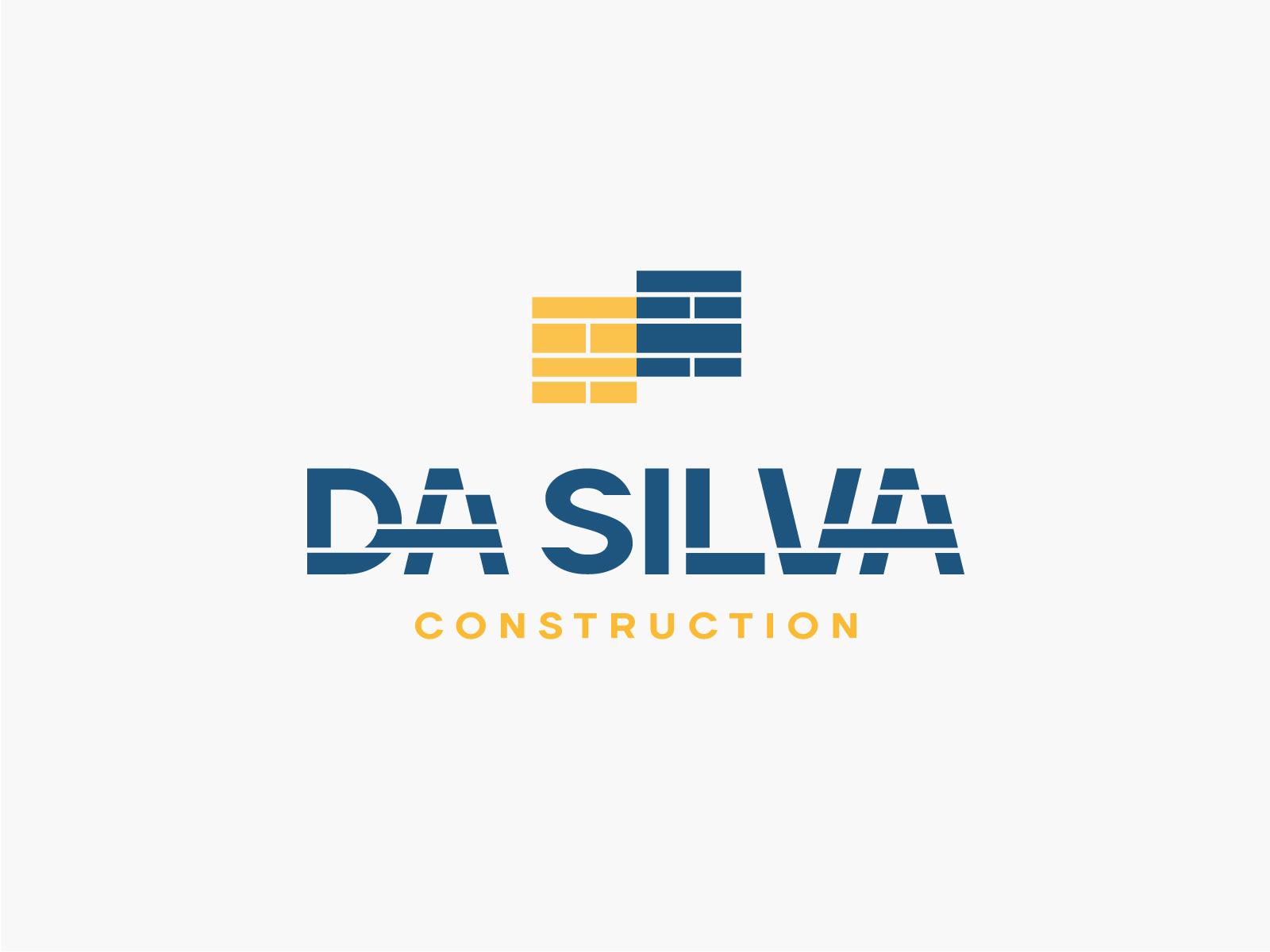
Logo creation for DA-SILVA Construction. A company of general masonry and structural works.
The logo makes clear reference to the company's construction work, reinforcing it's concept as much in the typography as in the symbols.
Development of a personalized and proprietary typography which makes the company's activity easily memorable.The word DA-SILVA is in "works" being built brick by brick until finding the desired form.
The symbol, simulates the construction and painting of the walls of a house. So it is dynamic and changes depending on the "house" and the work that needs to be done. Offering masonry work adapted to every individual project.
The result is a unique, strong, memorable logo. Full of personality which differentiates it from the competition. Offering not only a quality product, but a different, personalized service.


