Passion Fruits - Logo Grid


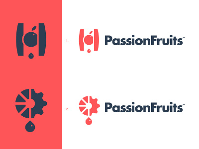
Yesterday, @Deividas Bielskis suggested me to use logo concept #2 for this brand but with some slight tweaks:
To start, round up the corners to make it more friendly.
Then, using two vivid colors to make it look more juicy 🍊
Lastly, removing the juice drop - less is more and this is enough to convey the message ⚙️
How do you reckon this change, do you think it is better than the previous iteration?
--
📨 Got a project? Let's work together! Email: wisecrafted@gmail.com
--