Logo / Icon design
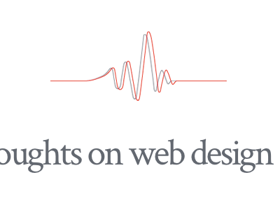
Came up with this simple logo designed around the idea of my writing being "semi-coherent" web design and development pieces. The red signifies the design side, the grey covers development and the offset positioning refers to the "semi-coherent" bit.
The lines also create a hidden "NM" which is really subtle but I quite like it.
More by Sam Hardacre View profile
Like
