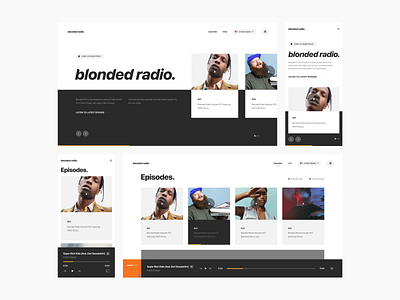
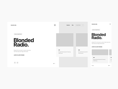
Blonded Radio Design Exploration Pt. 2
For today's design iteration, I've refined the wireframe for my blond radio concept. The idea is for the landing element to feature a carousel of top episodes. Screen two will show where all episodes live where you can view them in a grid or list view. I've also added in functionality intended for listening to live and recorded episodes directly from the site.
Typography: SF Pro Display
Grid: 12-Column
Photography: FPO
Screens: Desktop, Mobile (Home + Episodes)
Interested to hear your thoughts! Thanks.
—
Want more of a deep dive into my process?
Connect with me on Instagram
iPhone X_@2x.png
300 KB
iPhone X_@2x-1.png
500 KB
Desktop_@2x.png
1 MB
Desktop_@2x-1.png
900 KB
More by Landon Cooper View profile
Like


