Beute Kunst Screen Design
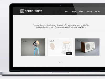
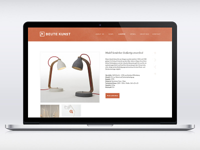
New and almost final version.
Got rid of the "red" and focused an contrast.
Switched to Futura for navigation, headlines, buttons and Proxima Nova for the paragraphs.
Plans for development: responsive, cms (don't know which we'll finally choose), pageload via ajax with some neat effects for sure ;)
All in all very clean and smooth, just how it should be.
Images are only placeholders taken from designspiration.net.
The mockup isn't that thrilling. Be sure to check the realpixels as well ;)
More by Justin Schueler View profile
Like


